@gtkx/react / AdwToolbarView
Variable: AdwToolbarView
constAdwToolbarView: (props) =>ReactNode&object
Defined in: packages/react/src/generated/compounds.ts:1309
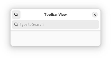
A widget containing a page, as well as top and/or bottom bars.
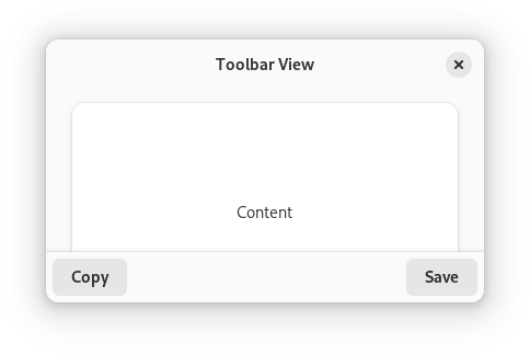
AdwToolbarView has a single content widget and one or multiple top and bottom bars, shown at the top and bottom sides respectively.
Example of an AdwToolbarView UI definition:
<object class="AdwToolbarView">
  <child type="top">
    <object class="AdwHeaderBar"/>
  </child>
  <property name="content">
    <object class="AdwPreferencesPage">
      <!-- ... -->
    </object>
  </property>
</object>
The following kinds of top and bottom bars are supported:
HeaderBarTabBarViewSwitcherBarGtk.ActionBarGtk.HeaderBarGtk.PopoverMenuBarGtk.SearchBar- Any
Gtk.Boxor a similar widget with the.toolbarstyle class
By default, top and bottom bars are flat and scrolling content has a subtle undershoot shadow, same as when using the .undershoot-top and .undershoot-bottom style classes. This works well in most cases, e.g. with StatusPage or PreferencesPage, where the background at the top and bottom parts of the page is uniform. Additionally, windows with sidebars should always use this style.
ToolbarView.top-bar-style and ToolbarView.bottom-bar-style properties can be used add an opaque background and a persistent shadow to top and bottom bars, this can be useful for content such as utility panes, where some elements are adjacent to the top/bottom bars, or TabView, where each page can have a different background.
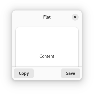
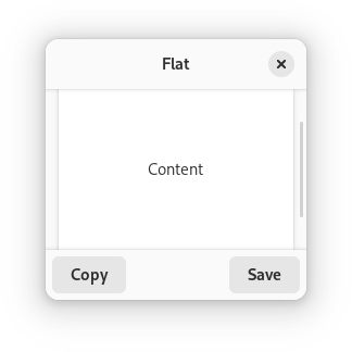
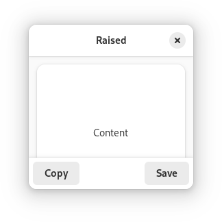
AdwToolbarView ensures the top and bottom bars have consistent backdrop styles and vertical spacing. For comparison:
Any top and bottom bars can also be dragged to move the window, equivalent to putting them into a Gtk.WindowHandle.
Content is typically place between top and bottom bars, but can also extend behind them. This is controlled with the ToolbarView.extend-content-to-top-edge and ToolbarView.extend-content-to-bottom-edge properties.
Top and bottom bars can be hidden and revealed with an animation using the ToolbarView.reveal-top-bars and ToolbarView.reveal-bottom-bars properties.
AdwToolbarView as GtkBuildable
The AdwToolbarView implementation of the Gtk.Buildable interface supports adding a top bar by specifying “top” as the “type” attribute of a <child> element, or adding a bottom bar by specifying “bottom”.
Accessibility
AdwToolbarView uses the GTK_ACCESSIBLE_ROLE_GROUP role.
Type Declaration
| Name | Type | Defined in |
|---|---|---|
AddBottomBar() | (props) => ReactNode | packages/react/src/generated/compounds.ts:1311 |
AddTopBar() | (props) => ReactNode | packages/react/src/generated/compounds.ts:1310 |