@gtkx/react / GtkFlowBox
Variable: GtkFlowBox
constGtkFlowBox:"GtkFlowBox"
Defined in: packages/react/src/generated/jsx.ts:12854
Puts child widgets in a reflowing grid.
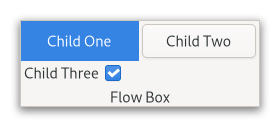
For instance, with the horizontal orientation, the widgets will be arranged from left to right, starting a new row under the previous row when necessary. Reducing the width in this case will require more rows, so a larger height will be requested.
Likewise, with the vertical orientation, the widgets will be arranged from top to bottom, starting a new column to the right when necessary. Reducing the height will require more columns, so a larger width will be requested.
The size request of a GtkFlowBox alone may not be what you expect; if you need to be able to shrink it along both axes and dynamically reflow its children, you may have to wrap it in a GtkScrolledWindow to enable that.
The children of a GtkFlowBox can be dynamically sorted and filtered.
Although a GtkFlowBox must have only GtkFlowBoxChild children, you can add any kind of widget to it via Gtk.FlowBox.insert, and a GtkFlowBoxChild widget will automatically be inserted between the box and the widget.
Also see Gtk.ListBox.
Shortcuts and Gestures
The following signals have default keybindings:
Gtk.FlowBox.:move-cursorGtk.FlowBox.:select-allGtk.FlowBox.:toggle-cursor-childGtk.FlowBox.:unselect-all
CSS nodes
flowbox
├── flowboxchild
│   ╰── <child>
├── flowboxchild
│   ╰── <child>
┊
╰── [rubberband]
GtkFlowBox uses a single CSS node with name flowbox. GtkFlowBoxChild uses a single CSS node with name flowboxchild. For rubberband selection, a subnode with name rubberband is used.
Accessibility
GtkFlowBox uses the Gtk.AccessibleRole.grid role, and GtkFlowBoxChild uses the Gtk.AccessibleRole.grid_cell role.