1. Window & Header Bar
In this tutorial, you'll build a fully-featured Notes application from scratch. Each chapter introduces new GTKX concepts by adding functionality to the app. By the end, you'll have a polished, deployable desktop application.
Create the Project
Start by scaffolding a new project:
npx @gtkx/cli@latest create notes-appChoose your preferred package manager and enable testing when prompted.
The Application Window
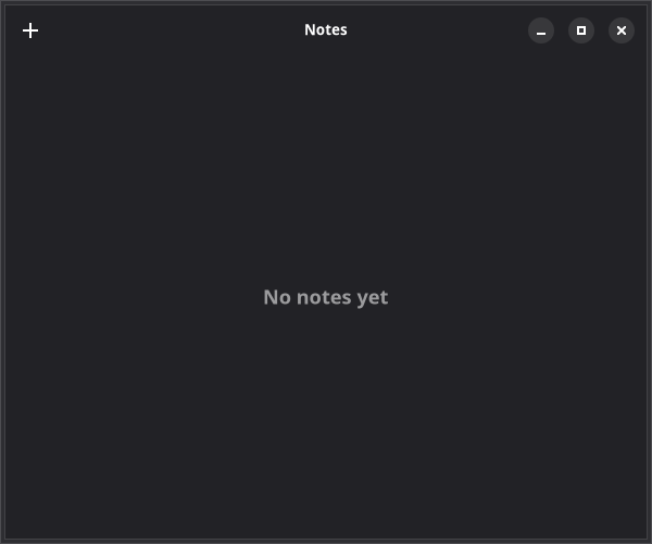
Replace the generated src/app.tsx with an Adwaita-styled window:
import { AdwApplicationWindow, AdwHeaderBar, AdwStatusPage, AdwToolbarView, quit } from "@gtkx/react";

export default function App() {
    return (
        <AdwApplicationWindow title="Notes" defaultWidth={600} defaultHeight={500} onClose={quit}>
            <AdwToolbarView>
                <AdwToolbarView.AddTopBar>
                    <AdwHeaderBar />
                </AdwToolbarView.AddTopBar>
                <AdwStatusPage
                    vexpand
                    iconName="document-edit-symbolic"
                    title="No Notes Yet"
                    description="Press + to create your first note"
                />
            </AdwToolbarView>
        </AdwApplicationWindow>
    );
}
Status Pages
AdwStatusPage is the standard GNOME pattern for empty states and placeholder views. It displays a centered icon, title, and description — use it instead of manual label layouts.
Compound Components
Notice <AdwToolbarView.AddTopBar> — this is a compound component. Instead of imperatively calling toolbar.addTopBar(headerBar), you declare the relationship in JSX. Compound components are auto-generated from GIR metadata and follow the pattern ParentWidget.SlotName.
Common compound components you'll see throughout this tutorial:
| Component | Purpose |
|---|---|
AdwToolbarView.AddTopBar | Add a widget to the top bar area |
AdwToolbarView.AddBottomBar | Add a widget to the bottom bar area |
GtkHeaderBar.PackStart | Pack a widget at the start of a header bar |
GtkHeaderBar.PackEnd | Pack a widget at the end of a header bar |
Slot Props
Some widgets accept a single child in a named position. These are expressed as slot props — JSX props that accept a React element:
<AdwHeaderBar titleWidget={<GtkLabel label="Notes" cssClasses={["heading"]} />} />The titleWidget prop replaces the default title text with a custom widget. Other common slot props include popover, startChild, endChild, and content.
Adding Header Bar Buttons
Add a "New Note" button to the header bar:
import {
    AdwApplicationWindow,
    AdwHeaderBar,
    AdwStatusPage,
    AdwToolbarView,
    GtkButton,
    quit,
} from "@gtkx/react";

export default function App() {
    return (
        <AdwApplicationWindow title="Notes" defaultWidth={600} defaultHeight={500} onClose={quit}>
            <AdwToolbarView>
                <AdwToolbarView.AddTopBar>
                    <AdwHeaderBar>
                        <AdwHeaderBar.PackStart>
                            <GtkButton
                                iconName="list-add-symbolic"
                                tooltipText="New Note"
                                onClicked={() => console.log("New note!")}
                            />
                        </AdwHeaderBar.PackStart>
                    </AdwHeaderBar>
                </AdwToolbarView.AddTopBar>
                <AdwStatusPage
                    vexpand
                    iconName="document-edit-symbolic"
                    title="No Notes Yet"
                    description="Press + to create your first note"
                />
            </AdwToolbarView>
        </AdwApplicationWindow>
    );
}
Tooltips
The GNOME HIG requires tooltips on all header bar controls. Always set tooltipText on buttons in the header bar so users can discover their function on hover.
Run npm run dev to see your app with a header bar and a "+" button.
Next
In the next chapter, you'll style the notes list with CSS-in-JS.