7. Settings & Preferences
Most desktop apps need a preferences dialog. GTKX provides useProperty and useSetting hooks to reactively bind your UI to GObject properties and GSettings values.
Adding a Preferences Menu Item
First, add a "Preferences" item to the menu button from Chapter 4:
<GtkMenuButton iconName="open-menu-symbolic" tooltipText="Main Menu">
    <GtkMenuButton.MenuItem
        id="new"
        label="New Note"
        onActivate={addNote}
        accels="<Control>n"
    />
    <GtkMenuButton.MenuSection>
        <GtkMenuButton.MenuItem
            id="preferences"
            label="Preferences"
            onActivate={() => setShowPreferences(true)}
            accels="<Control>comma"
        />
        <GtkMenuButton.MenuItem
            id="shortcuts"
            label="Keyboard Shortcuts"
            onActivate={() => {}}
            accels="<Control>question"
        />
    </GtkMenuButton.MenuSection>
    <GtkMenuButton.MenuSection>
        <GtkMenuButton.MenuItem
            id="about"
            label="About Notes"
            onActivate={() => setShowAbout(true)}
        />
    </GtkMenuButton.MenuSection>
</GtkMenuButton>
Defining a GSettings Schema
GSettings needs a schema that declares your keys, their types, and default values. Create a .gschema.xml file in your project root — gtkx dev will compile it automatically:
<!-- com.example.notes.gschema.xml -->
<?xml version="1.0" encoding="UTF-8"?>
<schemalist>
<schema id="com.example.notes" path="/com/example/notes/">
<key name="compact-mode" type="b">
<default>false</default>
<summary>Compact mode</summary>
<description>Use smaller spacing in the note list</description>
</key>
<key name="spell-check" type="b">
<default>true</default>
<summary>Spell check</summary>
<description>Highlight spelling errors while typing</description>
</key>
<key name="font-size" type="i">
<default>14</default>
<summary>Font size</summary>
<description>Base font size for the editor</description>
</key>
</schema>
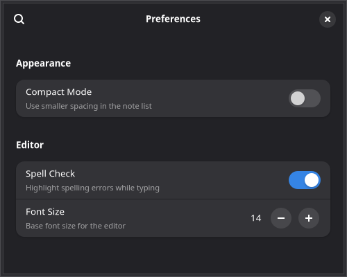
</schemalist>The Preferences Dialog
Libadwaita provides a ready-made preferences window built from AdwPreferencesWindow, AdwPreferencesPage, and AdwPreferencesGroup. Show it as a portal on the active window:
import {
    AdwPreferencesGroup,
    AdwPreferencesPage,
    AdwPreferencesWindow,
    AdwSwitchRow,
    AdwComboRow,
    AdwSpinRow,
    createPortal,
    useApplication,
    useProperty,
} from "@gtkx/react";

const Preferences = ({ onClose }: { onClose: () => void }) => {
    const app = useApplication();
    const activeWindow = useProperty(app, "activeWindow");

    if (!activeWindow) return null;

    return createPortal(
        <AdwPreferencesWindow
            title="Preferences"
            modal
            defaultWidth={500}
            defaultHeight={400}
            onClose={onClose}
        >
            <AdwPreferencesPage title="General" iconName="preferences-system-symbolic">
                <AdwPreferencesGroup title="Appearance">
                    <AdwSwitchRow
                        title="Compact Mode"
                        subtitle="Use smaller spacing in the note list"
                    />
                </AdwPreferencesGroup>
                <AdwPreferencesGroup title="Editor">
                    <AdwSwitchRow
                        title="Spell Check"
                        subtitle="Highlight spelling errors while typing"
                    />
                    <AdwSpinRow
                        title="Font Size"
                        subtitle="Base font size for the editor"
                        value={14}
                        lower={8}
                        upper={32}
                        stepIncrement={1}
                    />
                </AdwPreferencesGroup>
            </AdwPreferencesPage>
        </AdwPreferencesWindow>,
        activeWindow,
    );
};
Preferences Widgets
| Component | Purpose |
|---|---|
AdwPreferencesWindow | Top-level dialog with search and navigation |
AdwPreferencesPage | A page with title and iconName, shown in the sidebar when there are multiple pages |
AdwPreferencesGroup | A titled group of rows |
AdwSwitchRow | A row with a toggle switch |
AdwSpinRow | A row with a numeric spin button |
AdwComboRow | A row with a dropdown selector |
Reading and Writing Settings with useSetting
The useSetting hook subscribes to a GSettings key and returns a [value, setValue] tuple, similar to useState. When the setting changes (even from outside your app), the component re-renders automatically. Calling the setter writes the new value to GSettings.
import { useSetting } from "@gtkx/react";

function ThemeIndicator() {
    const [colorScheme] = useSetting("org.gnome.desktop.interface", "color-scheme", "string");

    return <GtkLabel label={colorScheme === "prefer-dark" ? "Dark mode" : "Light mode"} />;
}
Supported Types
The third argument selects the GSettings getter/setter used to read and write the value:
| Type | Returns | GSettings Methods |
|---|---|---|
"boolean" | boolean | getBoolean() / setBoolean() |
"int" | number | getInt() / setInt() |
"double" | number | getDouble() / setDouble() |
"string" | string | getString() / setString() |
"strv" | string[] | getStrv() / setStrv() |
Observing GObject Properties with useProperty
The useProperty hook subscribes to any GObject property via the notify:: signal. It returns the current value and re-renders whenever the property changes.
import { useApplication, useProperty } from "@gtkx/react";

function WindowTitle() {
    const app = useApplication();
    const activeWindow = useProperty(app, "activeWindow");
    const title = useProperty(activeWindow, "title");

    return <GtkLabel label={title ?? "No window"} />;
}
The return type is inferred from the ES6 accessor on the object — useProperty(app, "activeWindow") returns Gtk.Window | null without any manual type annotation. When the first argument is null or undefined, the hook returns undefined and skips signal subscription, so you can safely chain calls without conditional hooks.
How It Works
- Reads the initial value synchronously via the ES6 accessor
- Connects to
notify::property-nameon the GObject - On each notification, re-reads the property and updates React state
- Disconnects the signal on unmount or when inputs change
Wiring Preferences to Settings
Here's a complete preferences dialog that reads and writes GSettings values. The useSetting setter writes directly to GSettings, which fires the changed signal and keeps the UI in sync — even if the setting is changed externally (for example via gsettings set in a terminal or dconf-editor):
import schemaId from "../com.example.notes.gschema.xml";

const Preferences = ({ onClose }: { onClose: () => void }) => {
    const app = useApplication();
    const activeWindow = useProperty(app, "activeWindow");

    const [compactMode, setCompactMode] = useSetting(schemaId, "compact-mode", "boolean");
    const [spellCheck, setSpellCheck] = useSetting(schemaId, "spell-check", "boolean");
    const [fontSize, setFontSize] = useSetting(schemaId, "font-size", "int");

    if (!activeWindow) return null;

    return createPortal(
        <AdwPreferencesWindow
            title="Preferences"
            modal
            defaultWidth={500}
            defaultHeight={400}
            onClose={onClose}
        >
            <AdwPreferencesPage title="General" iconName="preferences-system-symbolic">
                <AdwPreferencesGroup title="Appearance">
                    <AdwSwitchRow
                        title="Compact Mode"
                        subtitle="Use smaller spacing in the note list"
                        active={compactMode}
                        onActiveChanged={setCompactMode}
                    />
                </AdwPreferencesGroup>
                <AdwPreferencesGroup title="Editor">
                    <AdwSwitchRow
                        title="Spell Check"
                        subtitle="Highlight spelling errors while typing"
                        active={spellCheck}
                        onActiveChanged={setSpellCheck}
                    />
                    <AdwSpinRow
                        title="Font Size"
                        subtitle="Base font size for the editor"
                        value={fontSize}
                        lower={8}
                        upper={32}
                        stepIncrement={1}
                        onValueChanged={setFontSize}
                    />
                </AdwPreferencesGroup>
            </AdwPreferencesPage>
        </AdwPreferencesWindow>,
        activeWindow,
    );
};
TIP
GSettings requires a compiled schema installed on the system. Importing your .gschema.xml file directly (as shown above) triggers automatic compilation via the GTKX Vite plugin — no manual build step needed.
Applying Settings to the UI
Settings are only useful if they change what the user sees. Read them in your top-level component with useSetting and pass the values down as props:
// app.tsx
import schemaId from "./com.example.notes.gschema.xml";

export function App() {
    const [compactMode] = useSetting(schemaId, "compact-mode", "boolean");
    const [fontSize] = useSetting(schemaId, "font-size", "int");

    // ... pass compactMode and fontSize to child components
    return (
        <GtkListView
            estimatedItemHeight={compactMode ? 50 : 80}
            renderItem={(note) => (
                <NoteCard note={note} compact={compactMode} fontSize={fontSize} />
            )}
        />
    );
}
Then use dynamic CSS to apply the values. The css function deduplicates by content hash, so identical interpolations reuse the same class:
import { css } from "@gtkx/css";

const NoteCard = ({ note, compact, fontSize }: NoteCardProps) => {
    const cardStyle = css`
        padding: ${compact ? 8 : 16}px;
    `;

    const titleStyle = css`
        font-weight: bold;
        font-size: ${fontSize}px;
    `;

    return (
        <GtkBox spacing={compact ? 2 : 4} cssClasses={[baseCard, cardStyle]}>
            <GtkLabel label={note.title} cssClasses={[titleStyle]} />
        </GtkBox>
    );
};
Because useSetting re-renders the component when the value changes, toggling a preference in the dialog updates the entire app instantly.
Next
In the final chapter, you'll package the Notes app for distribution.