6. Dialogs & Animations
Let's add confirmation dialogs for destructive actions and smooth animations for a polished feel.
Confirmation Dialogs
Use AdwAlertDialog with the responses prop and createPortal to show it on the active window:
import { AdwAlertDialog, createPortal, useApplication, useProperty } from "@gtkx/react";
import * as Adw from "@gtkx/ffi/adw";
import { useState } from "react";

const DeleteConfirmation = ({
    noteTitle,
    onConfirm,
    onCancel,
}: {
    noteTitle: string;
    onConfirm: () => void;
    onCancel: () => void;
}) => {
    const app = useApplication();
    const activeWindow = useProperty(app, "activeWindow");

    if (!activeWindow) return null;

    return createPortal(
        <AdwAlertDialog
            heading="Delete Note?"
            body={`"${noteTitle}" will be permanently deleted.`}
            responses={[
                { id: "cancel", label: "Cancel" },
                { id: "delete", label: "Delete", appearance: Adw.ResponseAppearance.DESTRUCTIVE },
            ]}
            defaultResponse="cancel"
            closeResponse="cancel"
            onResponse={(id) => {
                if (id === "delete") onConfirm();
                else onCancel();
            }}
        />,
        activeWindow,
    );
};
Using the Dialog
const [noteToDelete, setNoteToDelete] = useState<Note | null>(null);

const deleteNote = (note: Note) => {
    setNoteToDelete(note);
};

const confirmDelete = () => {
    if (noteToDelete) {
        setNotes(notes.filter((n) => n.id !== noteToDelete.id));
        if (selectedId === noteToDelete.id) setSelectedId(null);
        setNoteToDelete(null);
    }
};

// In JSX:
{noteToDelete && (
    <DeleteConfirmation
        noteTitle={noteToDelete.title}
        onConfirm={confirmDelete}
        onCancel={() => setNoteToDelete(null)}
    />
)}
Portals
createPortal renders a component as a child of a different GTK widget, outside the normal React tree. This is necessary for dialogs, which GTK requires to be children of a window — not nested deep inside other widgets.
See the Portals guide for more details.
Toggle Groups
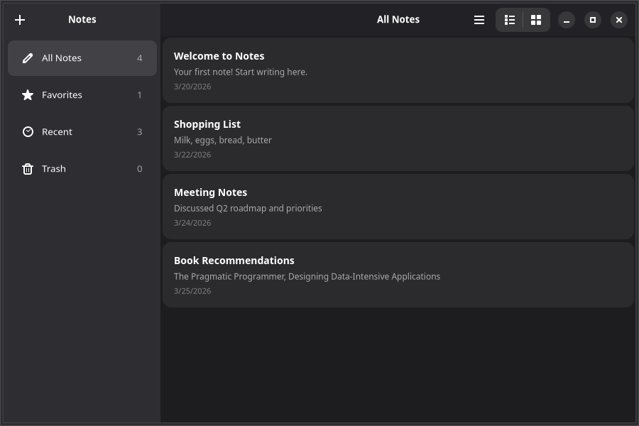
Let the user switch between list and grid views using AdwToggleGroup with the toggles prop:
import { AdwToggleGroup } from "@gtkx/react";

<AdwToggleGroup
    activeName={viewMode}
    onActiveChanged={(_index, name) => setViewMode(name ?? "list")}
    toggles={[
        { id: "list", iconName: "view-list-symbolic", tooltip: "List view" },
        { id: "grid", iconName: "view-grid-symbolic", tooltip: "Grid view" },
    ]}
/>
The toggles prop accepts an array of toggle definitions with id, label or iconName, and optional tooltip.
Grid View
Use GtkGridView to render items in a multi-column grid. It shares the same data API as GtkListView — items, renderItem, selected, and onSelectionChanged all work identically:
import { GtkGridView, GtkListView, GtkScrolledWindow } from "@gtkx/react";

<GtkScrolledWindow vexpand>
    {viewMode === "list" ? (
        <GtkListView
            estimatedItemHeight={80}
            selectionMode={Gtk.SelectionMode.SINGLE}
            selected={selectedId ? [selectedId] : []}
            onSelectionChanged={(ids) => setSelectedId(ids[0] ?? null)}
            items={filteredNotes.map((note) => ({ id: note.id, value: note }))}
            renderItem={(note) => <NoteCard note={note} />}
        />
    ) : (
        <GtkGridView
            minColumns={2}
            maxColumns={4}
            selectionMode={Gtk.SelectionMode.SINGLE}
            selected={selectedId ? [selectedId] : []}
            onSelectionChanged={(ids) => setSelectedId(ids[0] ?? null)}
            items={filteredNotes.map((note) => ({ id: note.id, value: note }))}
            renderItem={(note) => <NoteCard note={note} />}
        />
    )}
</GtkScrolledWindow>
GtkGridView adds two layout props:
minColumns— Minimum number of columns (items wrap to the next row)maxColumns— Maximum number of columns (prevents overly wide layouts)
Timed Animations
Wrap a widget with AdwTimedAnimation to animate its properties over a fixed duration:
import { AdwTimedAnimation, GtkBox } from "@gtkx/react";
import * as Adw from "@gtkx/ffi/adw";

const NoteCard = ({ note }: { note: Note }) => (
    <AdwTimedAnimation
        initial={{ opacity: 0, translateY: -10 }}
        animate={{ opacity: 1, translateY: 0 }}
        exit={{ opacity: 0, translateX: -50 }}
        duration={200}
        easing={Adw.Easing.EASE_OUT_CUBIC}
        animateOnMount
    >
        <GtkBox orientation={Gtk.Orientation.VERTICAL} spacing={4} cssClasses={[noteCard]}>
            <GtkLabel label={note.title} halign={Gtk.Align.START} cssClasses={[noteTitle]} />
            <GtkLabel label={note.body || "Empty note"} halign={Gtk.Align.START} cssClasses={[notePreview]} />
        </GtkBox>
    </AdwTimedAnimation>
);
Animation Props
initial— Starting values (set immediately on mount)animate— Target values (animated toward)duration— Animation length in millisecondseasing— Easing curve fromAdw.Easingdelay— Delay before startinganimateOnMount— Whether to animate when the component first renders
Animatable properties: opacity, translateX, translateY, scale, scaleX, scaleY, rotate, skewX, skewY.
TIP
Animation components work with regular widget children. They cannot be used inside GtkListView's renderItem — instead, animate the list container or use animations on views that are rendered directly in a GtkBox.
Spring Animations
AdwSpringAnimation uses physics simulation for natural-feeling motion:
import { AdwSpringAnimation, GtkButton } from "@gtkx/react";

<AdwSpringAnimation
    initial={{ scale: 0.8 }}
    animate={{ scale: 1 }}
    damping={0.7}
    stiffness={300}
    animateOnMount
>
    <GtkButton label="Add Note" cssClasses={["suggested-action"]} onClicked={addNote} />
</AdwSpringAnimation>
Spring parameters:
damping— How quickly oscillation settles (0 = undamped, 1 = critically damped)stiffness— Spring force (higher = snappier)mass— Simulated mass (higher = more inertia, defaults to 1)
Animating on Prop Changes
When the animate prop changes, the animation automatically runs to the new values:
const [expanded, setExpanded] = useState(false);

<AdwSpringAnimation animate={{ scale: expanded ? 1.1 : 1 }} damping={0.7} stiffness={250}>
    <GtkButton label="Expand" onClicked={() => setExpanded(!expanded)} />
</AdwSpringAnimation>
Exit Animations
Use the exit prop to animate when a component unmounts:
const NoteCard = ({ note }: { note: Note }) => (
    <AdwTimedAnimation
        initial={{ opacity: 0, translateY: -10 }}
        animate={{ opacity: 1, translateY: 0 }}
        exit={{ opacity: 0, translateX: -50 }}
        duration={200}
        animateOnMount
    >
        <GtkBox cssClasses={[noteCard]}>
            <GtkLabel label={note.title} />
        </GtkBox>
    </AdwTimedAnimation>
);
The widget stays mounted during the exit animation and is removed after it completes.
Skipping Initial Animation
Set initial={false} to start at the animate values without an entrance animation:
<AdwTimedAnimation initial={false} animate={{ opacity: isActive ? 1 : 0.5 }}>
    <GtkLabel label="Only animates on changes" />
</AdwTimedAnimation>
Animation Callbacks
Monitor animation lifecycle:
<AdwSpringAnimation
    animate={{ opacity: 1 }}
    onAnimationStart={() => console.log("Started")}
    onAnimationComplete={() => console.log("Finished")}
    animateOnMount
>
    <GtkButton label="Animated" />
</AdwSpringAnimation>
Toast Notifications
After a destructive action like deleting a note, show a toast notification with an undo option. Wrap the content area in AdwToastOverlay and create Adw.Toast objects imperatively:
import * as Adw from "@gtkx/ffi/adw";
import { AdwToastOverlay } from "@gtkx/react";
import { useRef } from "react";

const toastOverlayRef = useRef<Adw.ToastOverlay | null>(null);

const confirmDelete = () => {
    if (!noteToDelete) return;

    const deletedNote = noteToDelete;
    const deletedIndex = notes.indexOf(deletedNote);
    setNotes(notes.filter((n) => n.id !== deletedNote.id));
    setNoteToDelete(null);

    const toast = new Adw.Toast(`"${deletedNote.title}" deleted`);
    toast.buttonLabel = "Undo";
    toast.connect("button-clicked", () => {
        setNotes((prev) => {
            const restored = [...prev];
            restored.splice(deletedIndex, 0, deletedNote);
            return restored;
        });
    });
    toastOverlayRef.current?.addToast(toast);
};

// In JSX — wrap your content area:
<AdwToastOverlay ref={toastOverlayRef}>
    {/* ... notes list and empty state */}
</AdwToastOverlay>
When to Use Toasts
The GNOME HIG recommends toasts for short-lived event messages and one-time notifications. For persistent states (like "offline mode"), use AdwBanner instead. Toasts with an undo button are the preferred pattern for destructive actions — they let users recover from mistakes without a confirmation dialog slowing them down.
About Dialog
Every GNOME app should have an About dialog, accessible from the primary menu. Use AdwAboutDialog to display app name, version, credits, and license:
import * as Gtk from "@gtkx/ffi/gtk";
import { AdwAboutDialog, createPortal, useApplication, useProperty } from "@gtkx/react";

const About = ({ onClose }: { onClose: () => void }) => {
    const app = useApplication();
    const activeWindow = useProperty(app, "activeWindow");

    if (!activeWindow) return null;

    return createPortal(
        <AdwAboutDialog
            applicationName="Notes"
            applicationIcon="document-edit-symbolic"
            version="0.1.0"
            developerName="GTKX Tutorial"
            website="https://gtkx.dev"
            copyright="© 2026 GTKX Contributors"
            licenseType={Gtk.License.MIT_X11}
            developers={["GTKX Contributors"]}
            onClosed={onClose}
        />,
        activeWindow,
    );
};
Then wire it up from your menu:
const [showAbout, setShowAbout] = useState(false);

// In your menu:
<GtkMenuButton.MenuItem id="about" label="About Notes" onActivate={() => setShowAbout(true)} />

// In your JSX:
{showAbout && <About onClose={() => setShowAbout(false)} />}
Next
In the next chapter, you'll add a preferences dialog that reads and writes system settings.